Class advert


Colour: From the black and white color scheme we can see that the advert is meant to be more serious. This reflects the attitude of the potential target audience.
Framing and composition : The poster doesn't seem to have such a strong frame however the two images are split across the middle with the rappers image on one side and the text on the other. This helps to divide the visual and textual message of the poster without conveying separate messages to one another (this is re-enforced with the split line not being too thick)
Size: Both the text and the image are split into quiet an equal size expressing that there is an equal amount of emphasis and importance on both the quote and the person.
Setting and type of shot/angle: The type of shot that is used for 50 Cent is a head to shoulder shot which helps to add emphasis on his expression which aids the quote to convey the serious and motivational message. The photo is shot with only a black background which suggests something that's deep with endless meaning (working in synergy with the quote) This also helps to add focus on the rapper and also helps to highlight his expression.
Subject matter: The slogan used highlights the importance of being who you are and staying true to yourself. The fingerprints behind the quote highlight the whole concept of being who you are - we are like the fingerprint and that cannot change. The sole focus of the individual on the left hand side also shows acceptance and highlights who we are shouldn't be determined by the setting - we should ignore the things that may make us lose our confidence in ourselves and our dreams.
Lighting: The affect of the facial expression of the Rapper shows one of determination, drive, courage and passion. This works in synergy with the quotation which talks about doing what you need to do today, and not wait for tomorrow.
Pose: He is standing in a sideways posture which suggests that hes ready to 'fight' which could be a metaphor for being ready to fight for what he believes in.
Dominant/ prefered reading: The brand what the audience to focus of their 'survival' and ability to fight back. They would like to associate themselves with people/things who are unique and true to themselves. The brand what to be seen and attached to the idea of being able to succeed and reach the top even from the toughest backgrounds.
Negotiated reading: The audience may interpret it being a brand who gives strength to the people who might be associated in things like gang crimes and suggesting they can succeed if they have the determination.
Oppositional view: The audience may assossiate the brand with being overly aggressive and stand off ish, people may interpret the brand as being too involved in negative things such as going to prison(the finger print) and gang crime.
Own chosen advert
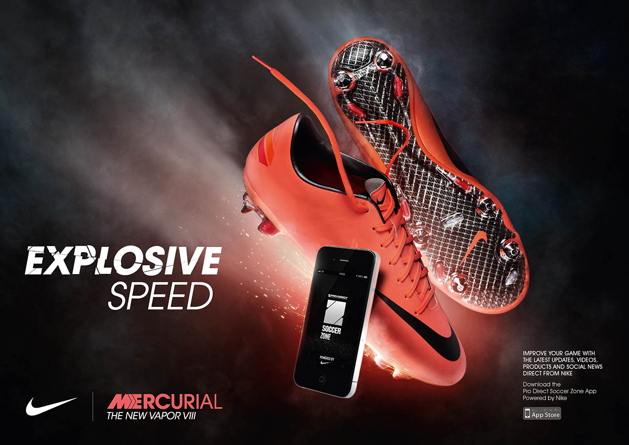 |
Color: The colour of the shoes is a pretty fiery orange colour which works in synergy with the slogan of being "explosive"
Framing: There isn't any clear border around it but it does have a plain black back drop which helps to limit attention drifting from the main focus (of the phone,shoes and slogan)
Composition: All the main aspects of the poster have their own space which suggests they have around the same importance as each other.
Size: The size of the shoes takes up a section of its own highlighting one of the well known and trusted aspect of the company. There is a phone that takes up 50% of the shoes show which means that this new app is just as important. The text is of a medium size suggesting the words are important aspect but the main focus is on the shoes and app (on the phone)
Type of shot/angle: The type of shot used is a medium shot so we get a full image of the shoes and have empty space around them in order to give it a plain and simple backdrop
Subject matter: The subject matter is the app that is powered by Nike (you can tell from the small print in the corner of the text suggesting that most the audience is most likely to already know this information and if they don't they can read it if they are interesting) which keeps the poster much more pleasing to the eye,
Setting: It doesn't have much of a setting showing that the setting doesn't have as much importance as the product itself
Lighting: Most the lighting seems to be around the shoes which also helps to add to the feel of the product being "explosive" and fast as it still had the sparks lit behind it. This adds overall focus to the product.
The dominant/preferred reading: is the idea of a company who has a lot of passion and light - its about determination.
Oppositional reading: The audience may see it as a company for people who are too impulsive and destructive.
No comments:
Post a Comment